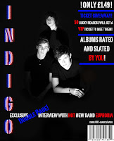
^This is the image I chose for my magazine cover. I picked out three main possible images to use and after a lot of thought i decided to go for the one above. I chose this image because it has all three boys in, so this would represent the whole band being there. If I chose one of the others as the cover image, readers might assume that 'Euphoria' is only one person. I like this image because the black and white strongly contrast against each other. The image is clear and strong and their faces are highlighted. In the middle is the original image. I edited three images in the same way, so they all look similar and follow a theme. I was worried that the images having a black background would appear too dark on the front of the magazine, but by using light fonts the over all image of the cover is brightened. The the right is the complete cover, this shows what I did to lighten the image. e.g using coloured fonts.
Again, the first image (on the left) is the image I chose to be on the double page spread. I chose this image because i liked the pose he was doing and, after editing,Ii liked the way it looked in black and white. The central image was what the photograph looked like before and the image on the right is my completed double page spread.


No comments:
Post a Comment